In the fast-paced digital world, a well-designed website is no longer optional; it’s essential. Yet, many business websites—despite having good intentions—fall into common web design traps that can cost them customers, revenue, and even reputation. The objective of web design should not only be to create an aesthetically pleasing site but to develop one that enhances the user experience (UX), improves conversion rates, and supports your business goals.
In this article, we’ll explore five common web design mistakes that could be negatively impacting your business. From poor navigation to lack of mobile responsiveness, each of these errors has the potential to reduce site traffic, frustrate users, and ultimately hurt your bottom line. Let’s dive in and see how you can avoid these pitfalls to create a more effective and engaging online presence.
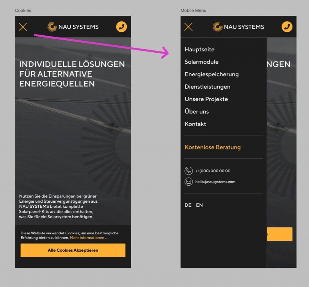
Mistake 1: Overly Complex Navigation
Why It Matters
When users visit your site, they expect to find the information they need quickly and effortlessly. If your navigation is overly complex, with numerous layers and confusing menus, visitors can quickly become frustrated and leave.
The Impact on Business
Poor navigation leads to high bounce rates, as users abandon the site rather than attempting to locate what they need. This results in lost potential customers and sends negative signals to search engines, which can harm your search ranking.
Solution
- Simplify Menus: Limit your primary menu to no more than five or six items.
- Use Descriptive Labels: Avoid jargon; use clear, intuitive terms.
- Implement Breadcrumbs: These help users easily trace their path and navigate back to previous pages.
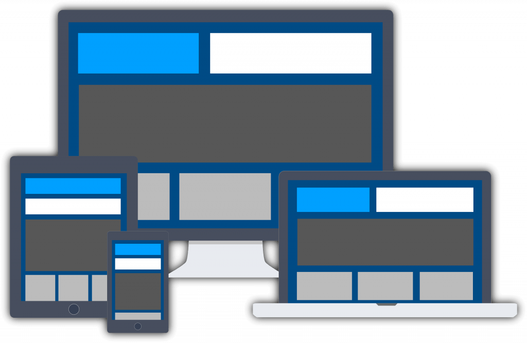
Mistake 2: Ignoring Mobile Optimization
Why It Matters
With mobile devices accounting for more than half of global web traffic, ignoring mobile optimization is a costly mistake. If your site doesn’t look or function properly on smartphones and tablets, you risk losing a significant portion of your audience.
The Impact on Business
Google has adopted a mobile-first indexing approach, meaning it prioritizes the mobile version of your site when determining rankings. Poor mobile design can hurt your SEO performance, reduce organic traffic, and frustrate mobile users, leading to higher bounce rates.
Solution
- Responsive Design: Ensure your site adjusts seamlessly across all screen sizes.
- Prioritize Content: Display only essential information on smaller screens.
- Test on Real Devices: Don’t rely solely on simulators; test your site on various devices to see how it actually performs.

Mistake 3: Slow Loading Times
Why It Matters
Users expect websites to load within two to three seconds. Longer load times can discourage visitors from exploring further, especially on mobile devices where attention spans are shorter.
The Impact on Business
Slow loading times lead to high bounce rates and missed opportunities. Additionally, page speed is a ranking factor in Google’s algorithm, so a slow site can hurt your search engine ranking and visibility.
Solution
- Optimize Images: Compress images without sacrificing quality.
- Leverage Caching: Use caching plugins or server-side caching to reduce load times.
- Limit Plugins and Scripts: Avoid unnecessary plugins, and streamline code by minimizing JavaScript and CSS files.

Mistake 4: Inconsistent Branding and Visual Design
Why It Matters
Your website is an extension of your brand, so consistency in colors, fonts, and imagery is essential to establish brand identity. If your design lacks coherence, it can confuse visitors and make your brand appear unprofessional.
The Impact on Business
Inconsistent branding reduces credibility and can dilute your brand image, making it harder for visitors to remember you. A disjointed visual style can distract users and reduce engagement, impacting conversion rates.
Solution
- Create a Style Guide: Develop a brand guide that outlines fonts, colors, and image styles.
- Use Professional Imagery: Avoid stock images that look generic. Instead, invest in high-quality, unique visuals.
- Apply Consistent Formatting: Ensure that headers, buttons, and icons follow the same design rules throughout the site.

Mistake 5: Lack of Clear Calls-to-Action (CTAs)
Why It Matters
A website without clear CTAs is like a store without signs. CTAs guide users towards desired actions, whether it’s making a purchase, signing up for a newsletter, or contacting you. Without them, visitors may not know what to do next.
The Impact on Business
Without effective CTAs, you’re missing out on opportunities to convert visitors into leads or customers. A lack of direction can leave users feeling lost, decreasing the likelihood that they’ll complete a purchase or engage further with your brand.
Solution
- Make CTAs Stand Out: Use contrasting colors and prominent placement.
- Use Action-Oriented Language: Instead of generic phrases like “Click Here,” use specific language, such as “Get Your Free Quote.”
- Limit Options: Avoid overloading pages with multiple CTAs, as this can overwhelm users. Focus on one primary action per page.
Conclusion
Web design mistakes are often unintentional, but they can have a significant impact on your business’s growth and success. By focusing on user-friendly navigation, mobile responsiveness, fast loading times, consistent branding, and effective CTAs, you can create a website that not only attracts visitors but keeps them engaged and drives conversions.
At WebHive Agency, we specialize in building optimized, user-friendly websites that enhance user experience and support business growth. If you’d like to learn more about how we can help improve your website’s performance and usability, get in touch with us today.